Problem 156 Graphs

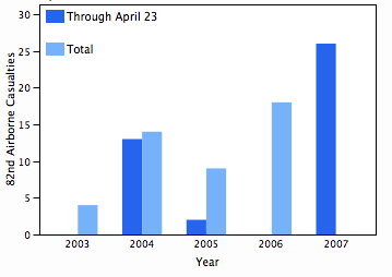
Problem 156 at Project Euler is one of the few without a specified limit. That is, most problems might ask for something like the sum of all solutions to an equation that are less than a billion. This one just asked for the sum of all solutions. When I first solved it, I just used the sum of solutions up to a trillion, which was good enough. Later I made some plots to help understand why there are no higher solutions.

Mild spoilers below if you’re thinking about trying the problem.

The problem is to find the solutions to f(x) = x where f(x) is the number of times a given digit, say 4, appears in all the numerals corresponding to the numbers from 1 to x. The equivalent problem is to find where f(x) – x = 0. The plots below show f(x) – x at different scales.

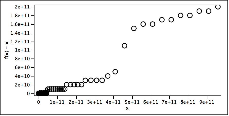
The first scale suggests f(x) – x for the whole range I looked at.

math156-1.png

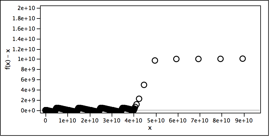
The second scale shows where the function really takes off and why. For each 1e10 range there seems to be about as many 4s as numbers (the function keeps dipping to around 0) until it gets to 4e10 when each new number in the 4e10 to 5e10 range has at least one 4 and sometimes more, so the function really takes off, especially at 4.4e10.

math156-2.png

Zooming in more shows a fractal-like nature to the function.

math156-3.png

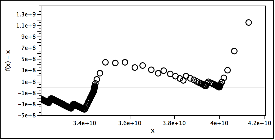
The varying density of the points is because my implementation makes fewer evaluations when further away from the origin.

math156-4.png

Casualties Graph

Today’s Raleigh News & Observer ran an article about increased casualties within the 82nd Airborne Division, which is based here in North Carolina. There was a graph showing casualties by year, with the 2007 total being incomplete. A reader objected to the incomplete year being shown next to the complete years, and editor Ted Vaden thoughtfully opened a Reader’s Corner blog item to discuss ways the paper might have done a better job with the visualization.

I made a suggestion and later found some data at icasualties.org (which doesn’t quite agree with the N&O data from the Associate Press) to use to try out a few ideas.

First, this was my suggested idea, with one set of bars for the partial years values and another set of bars for the full year values. Here I overlaid the two since one is a subset of the other. You can at least see that the partial year total is not indicative of the full year total.

casualties1.png

Next is the same thing with the bars side-by-side.

casualties2.png

Another commenter suggested a view by month, which is revealing in showing clumps of dangerous periods for this division. The graph still has the problem that the bar for the final partial month carries the same weight as the other months. And the graph is showing a lot of data just to support a newspaper story.

casualties3.png

Given the sparseness of the data, I tried clumping the data into trimesters of 4 months each. Not bad but a trimester is not a common year division, adding a little work to decipher the date axis.

casualties4.png

Another idea is to look at average casualties per month for each year, but this has a more subtle partial data issue since 2007 has fewer values to average and so is less representative of the year. This is really equivalent to projecting the partial 2007 values for the full year, which the editor intentionally avoided.

casualties5.png

Finally, here’s a more scientific view, showing the monthly values with a trend line (spline smoother) overlaid.

casualties6.png

Thanks, Steve, for pointing me to this issue.

Automobile Maker Market Share Chart

A week or so ago, Junk Charts featured a discussion (Rip Tide) of a New York Times chart of how auto-maker market share distribution in the US is becoming more like it is in Europe. The original chart showed lots of information in a pleasant way, but as usual folks want to do better — either to look better or to make the point better.

I scraped the data (csv) from the chart (thanks GraphClick), and provided a rough alternative to the graph.

auto market share distributions

My graph aims to show only enough information to support the text of the original chart. I chart ordered market share histograms for three different years so one can get a sense of how the US and European market share distributions are changing. I’m not sure how well the data supports the thesis though — it looks like both distributions are becoming more like the other rather that just US becoming more like Europe.

I just found out today that Junk Charts actually made use of the data I posted and provided yet another alternate view (Calming the Rip Tide). Interesting, but I don’t think the boxplots work since they don’t show a trend.

From Hayseed to Ubergeek

What a journey! From being labeled a “hay seed” [sic] by an anonymous blog commentor to being recoginized as a “ubergeek” in print by the Raleigh News & Observer. The G.D. Gearino column in today’s paper traces his steps to track down my gender-neutral first name analysis that a fellow reporter somehow got whiff of at a bar or party.

I don’t know who leaked the exercise, but now it’s out there. I used the Wake County registered voter database to analyze gender distributions of various first names to see which one was the most gender neutral. Of course, there are lots of ways to measure neutral, but I used the statistical definition of independence, looking for the name whose female/male ratio was most similar to that of the population (53% female) with the smallest confidence interval. Casey was the top name followed by Carey.

I explored the time component, but didn’t factor it into my analysis. Just as names go in and out of favor they also change genders over time. For instance, Morgan was more male, but these days it’s more female. That is, an older voter named Morgan is likely to be male, and a young voter named Morgan is likely to be female. Most neutralish names move toward female. The only names that I remember going from female to male over time were Frankie and Robbie.

Orange County doesn’t seem to have voter names on-line — just summary statistics by precinct.

Data Visualization Winner

Data Visualization Winner BadgeMy week-end and evenings spent staring at pixels paid off as Comprehensive Winner designation in Business Intelligence Network‘s Data Visualization Competition. My entry included visualizations for all five scenarios, and I won the checking account scenario and tied for first in the freestyle scenario, in which I revised the old OWASA water graph. The analysis of the winners and other entries will be released later, and I look forward to reading them. Unless one of my entries for the other scenarios is highlighted as an example of what not to do.

The checking account scenario was so simple I almost didn’t enter it. It involved a checking account statement with only 7 or 8 transactions for a given month. I thought it would have been a better challenge to visualize a statement with dozens of transactions, some occurring on the same day. I did the simple visualization in a way that was scalable to the more complex case, which may have helped my entry.

I found problems with all of my entries soon after submitting them, but I thought the budget summary scenario was my best entry (PDF). Below is the updated OWASA graph (my JMP version, original OWASA version). Getting my contour colors from Color Brewer probably helped.

Visual Pain Scale

Pain Scale


I never like it when doctors ask you to rate you pain level on a scale of 1 to 10, and I really don’t see the how it helps to visualize the pain scale. Even stranger, this scale is from a poster at the vet with a graphic of a dog skeleton.

Is the dog supposed to point at the bone that hurts and at the appropriate tick on the pain scale?

In case you can’t read the text, this scale goes from 0 = Pain Free to 10 = Worst Possible Pain.